


2026 State of B2B Technical Sales
Founder of Salescycle, Joe Delfino, shares how modern sales is about investing in people {% module_block module...
1 min read
![Marketing Tip of the Week: Use Buyer Behavior to Prioritize Mobile-Friendly Web Design [Video]](https://www.launchteaminc.com/hubfs/Screenshot_2016-06-17_10.23.26.png)
MTOTW #53: More people are now using mobile for search, but it varies by industry. Find out how your customers search before jumping into a web redesign.
According to Google, mobile search has now overtaken desktop search worldwide, although both types of search have increased. In addition, more people than ever are “multiscreening” – moving from one device to another – often to complete the same task. This consumer behavior, paired with Google's 2015 algorithm update giving more weight to mobile-friendly sites, makes it more important than ever for companies to ensure a seamless customer experience on all platforms.
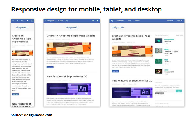
Responsive Web Design: 50 Examples and Best Practices – Designmodo
We’ve helped several clients apply mobile-friendly responsive design to their websites. Responsive design is preferable to a separate mobile site because lets you manage just one domain, and it makes for a better user experience whether you’re using a tablet, phone, or desktop computer. The SEO advantages bring visitors to your site, while the ease of use helps convert them to leads.
With that said, mobile usage does vary by industry. For many of the B2B companies we work with, we’ve found that most buyers still do their research on desktop. The mobile overview tool in Google Analytics can show you the breakdown of your visitors, so you can effectively prioritize mobile optimization for your company.
Each week, we share a quick tip for marketing success on our YouTube and Instagram channels. Follow us there or subscribe to our blog updates so you never miss a tip.
Have a question or request for a future tip? Let us know.
Want more web design tips? Download our toolkit to create inviting, optimized landing pages.


Founder of Salescycle, Joe Delfino, shares how modern sales is about investing in people {% module_block module...

Key Takeaways: The semiconductor market is entering a production-scale growth phase, driven by AI infrastructure and advanced packaging. US fab...

Updated June 2026 Whether you’re a startup working through a product launch or a large enterprise operating a small division, there will probably...