


2026 State of B2B Technical Sales
Founder of Salescycle, Joe Delfino, shares how modern sales is about investing in people {% module_block module...
2 min read
According to HubSpot, a call-to-action (CTA) is a link or image that drives traffic to a lead-generating landing page, i.e., a webpage with a form to capture visitor information. It instructs the viewer to take a specific next step with your brand, such as downloading a whitepaper or requesting a consultation.

A CTA should be easy to find, easy to read, and to the point. It can be as simple as a few words of linked text or a plain button, or it can be more graphically complex, featuring an image or additional explanation, as long as the message is clear. There should be no question as to what the viewer is being asked to do.
Discoverable: If you’re creating a button or more graphical CTA, use an accent color to make it stand out on your webpage. Position the CTA above the fold (the part of the webpage you can see without scrolling) whenever the layout of the page allows.
Readable: Make sure the text is large enough to be read without difficulty. Choose bold, simple fonts, avoid complicated backgrounds, and beware of overcrowding.
Actionable: Use straightforward, imperative phrases to tell viewers what their next step should be. For example, “Download the Optics Prototyping eBook” inspires action better than “Optics Prototyping eBook”, a simple statement of the offer.
CTAs are most often included on the pages of a company website, but they can also be placed:
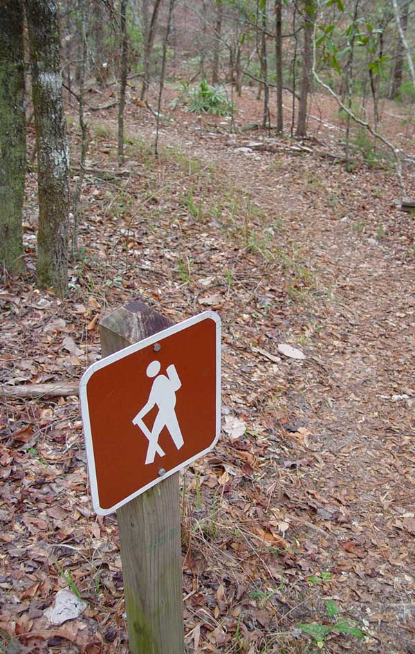
In most cases, a piece of content accessed through a CTA can itself include another CTA that suggests further action. A chain of CTAs, landing pages, and content should serve to move someone along the conversion funnel and ultimately convert them into a customer. Think of CTAs like markers on a trail that guide hikers (your prospects) to their destination (your product or service), with some content stops along the way.

Note: The other links in this email ("learn more" & "Developing an Effective SOP Process") lead to webpages without forms; however, these pages include their own CTAs.
The more specific the ask, the better. A CTA should be a relevant, logical next step for the audience that is most likely to see it. For example, someone visiting your website for the first time might be interested in a tip sheet download but not ready for webinar; so include the tip sheet CTA on the webpage, then offer the webinar later in an email lead nurture campaign.

(^^Make CTAs like this one!^^)

Founder of Salescycle, Joe Delfino, shares how modern sales is about investing in people {% module_block module...

Key Takeaways: The semiconductor market is entering a production-scale growth phase, driven by AI infrastructure and advanced packaging. US fab...

Updated June 2026 Whether you’re a startup working through a product launch or a large enterprise operating a small division, there will probably...